


Every Mac app wants its own window, menu bar icon, keyboard shortcut, or Dock slot. The result is not a lack of tools. It is a lack of place. Useful things are scattered across surfaces that disappear behind the work, and finding a small control can take more attention than using it.
Droppy's Shelf starts with a physical idea: give the top of the display a stable job. On a notched MacBook, that place grows out of the notch. On a notchless Mac or an external display, it appears as a floating island in the same predictable area. You always know where to aim and where to look.
The Shelf can hold files, clipboard history, media, timers, calendar and reminder information, notifications, and optional widgets. It is not meant to show all of that at once. Its value comes from putting the few things you use during the current day behind one familiar gesture.
A stable place is faster than another shortcut
Keyboard shortcuts are excellent when you remember them. Windows are excellent when you want to focus on one app. The Shelf covers the middle: small pieces of state and small actions you need repeatedly while something else remains full-screen.
Drag a file to the top. Check what is playing. Start a timer. Look at the next calendar item. Retrieve a recent copy. None of those tasks deserves a trip through several windows, but each deserves more room than a tiny menu bar icon can provide.
Consistency matters across displays. If a utility only works because a MacBook has a physical camera cutout, it falls apart the moment you move to a studio monitor. Droppy treats the notch as one visual anchor, not a hardware requirement.
Files: the original Shelf job
The simplest Shelf workflow is temporary file parking. Drag a file up, drop it on the Shelf, navigate to the destination with both hands free, then drag it out. This turns one long, fragile drag into two short ones.
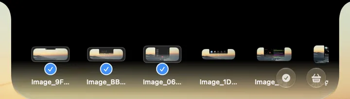
Files on the Shelf can form a working set. In the capture below, image thumbnails share one horizontal row and the first three are selected. Keep that exact set visible until its handoff is complete, then clear the surface. The Shelf is most useful as a transit layer, not as another permanent archive.
For a target that should come to the pointer instead, use the Basket. It appears during an active drag after a jiggle and is better for distant pointers, unfinished destinations, and separate temporary piles. The Shelf stays put. The Basket travels to the job.
Clipboard history beside the files it supports
Files and copied material often belong to the same task. A support reply needs a screenshot and an account reference. A release post needs images, a version number, and a URL. Putting clipboard history near the file surface keeps those ingredients close without pretending they are the same thing.
The quick clipboard view is for recent retrieval: find a copied item, paste it, continue. When the history needs real management, Droppy's dedicated Clipboard window provides more room for search, filters, tags, pins, and multi-selection. The Shelf remains the fast route, not a miniature replacement for the full surface.
Park a file at the top, keep a working set together, then drag it out once the handoff is done.
Recent copies sit beside the files they support, ready to paste without opening the full clipboard window.
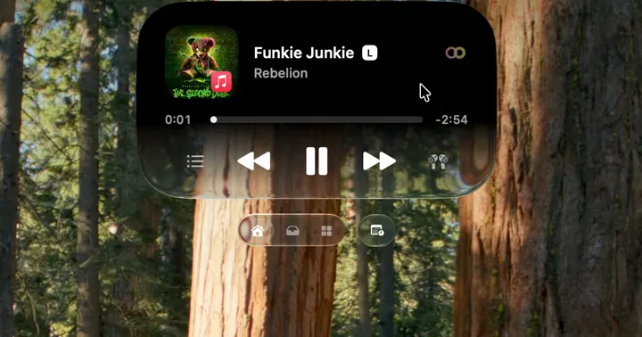
Apple Music or Spotify controls stay at the top with artwork, transport, and the queue, so the app stays out of the way.
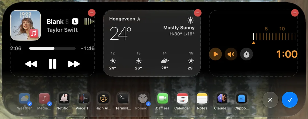
The Custom Shelf holds up to four widgets, from timers and calendar to weather and notifications.
Each part earns its slot only when it removes a recurring interruption.
Media that stays available without owning the screen
Music is ongoing state. You care about the current track, play or pause, the queue, and sometimes lyrics, but you do not want the music app above the document every time a song changes.
The media widget keeps Apple Music or Spotify controls at the top, with artwork and the playback information that matters now. Optional Lyrics can follow timed lyrics beside the media experience. The point is not to recreate a full streaming app. It is to handle the frequent controls and glanceable state while the real app stays out of the way.
Timers, calendar, and reminders
A timer is useful precisely when you can see that it is running. Pomodoro puts focus progress in the same place as the rest of the Shelf and can continue as a compact live activity when the full surface is closed. Calendar and reminder views give the next commitment or task a small, consistent home.
These widgets should reduce checking, not create more of it. If the full calendar is always open on a second display, a Shelf calendar may add nothing. If you work in one focused window and repeatedly wonder what starts next, it earns the slot.
Notifications without surrendering the whole corner
Notifications are another stream that benefits from a deliberate surface. Droppy's notification tools can show recent Mac notifications around the notch and expose them through a widget. That gives missed items somewhere to be reviewed instead of relying on a banner you had one chance to notice.
This is not an argument for more alerts. The best notification setup starts by turning off noisy sources in macOS. The Shelf is for the smaller set that remains useful enough to revisit.
Custom Shelf: choose up to four widgets
The Custom Shelf lets you assemble up to four widgets that match how you work. That limit is useful. A shelf with every available tool would become a second desktop, full of tiny things competing for attention. Four asks you to pick a working set.
The current picker makes that selection literal. In the capture, Media, Weather, and Pomodoro carry blue checks, and those three large cards occupy the Shelf above. Other installed choices stay in the row without taking a large slot. Up to four widgets can be selected, but an empty fourth slot is better than adding a card with no job.
Droppy also supports shelf layouts for focused use, including a split arrangement when two widgets genuinely belong together. Use it for combinations such as media and lyrics or calendar and tasks. Do not split just because the option exists. Larger single widgets are easier to read and interact with.
Notched MacBooks, notchless Macs, and external displays
On a modern MacBook Pro or MacBook Air with a notch, the Shelf feels attached to the hardware. The black area becomes the collapsed state, and the working surface opens from it. That visual connection is useful, but the functionality does not depend on the cutout.
On a Mac without a notch, Droppy uses a Dynamic Island style floating surface at the top. On an external display, the Shelf can follow the screen where you are working. The goal is the same landmark across a mixed setup, not a feature that disappears whenever the laptop lid closes.
If you use several displays, configure the Shelf around where attention actually lives. A permanent surface on every screen can become visual repetition. A predictable surface on the active or chosen display is usually calmer.
One exact sequence: select files, then control media
Begin in the file state shown above. Several image thumbnails are parked in one horizontal row, and the first three carry blue selection checks. That is the quick staging job: keep the files together, select the exact set, and leave their source windows behind.
Then move to Media on the same Shelf. The real media capture shows Funkie Junkie by Rebellion at 0:01, with previous, pause, and next controls in the center. Pausing the track does not require finding the music window, and returning to the file view does not require recreating the selected file group.
The Custom Shelf capture shows how those jobs can sit beside selected widgets. Media, Weather, and the one-minute timer are visibly enabled, while the picker keeps other installed widgets available without putting every one on screen. The value is the sequence between real states, not a dashboard that tries to display everything at once.
Configure only what removes friction
Droppy offers many tools because different Macs do different jobs. That does not mean one Mac should enable all of them. Every unused widget adds a choice. Every extra notification adds a reason to look. Every shortcut you do not remember becomes settings clutter.
Begin with one problem. If moving files is awkward, enable the file surface. If copied material disappears, add Clipboard. If music pulls you out of work, add Media. Use the Mac for a week, notice the next recurring interruption, and add one tool only when it has a clear job.
The Shelf fits people who like a consistent place for small, cross-app tasks. If you prefer dedicated windows and already have shortcuts for everything, it may duplicate a system that works. If you only need temporary file parking, a single-purpose shelf app can be leaner. Droppy makes sense when several of these small needs belong together at the top of the screen.