


The worst part of a video call is the thirty seconds before it. You know it is now. You do not know where the link is. It was in an invitation, or a thread, or a calendar entry whose notes you have to scroll. By the time you find it and the app finishes launching, you are the person who joined late again.
The scramble at the top of the hour
A recurring call has a link that never changes and that you never remember. A one off has a link buried in whichever tool the organiser used. Both end the same way: you are searching for a URL while people wait, with the app you were working in still open behind you.
The information is not missing. It is in the calendar event, in the URL field or the location or the notes, put there by whichever system created the invitation. It is simply not somewhere you can reach without opening Calendar, finding today, finding the event, and reading it.
Calendar alerts tell you, then stop helping
A standard calendar alert is a notification that fires at a fixed offset and then disappears. It tells you a meeting exists. It does not tell you how long is left once you are in it, and it certainly does not join anything. Dismiss it while you are mid sentence and it has done its entire job.
The usual patch is a second alert, a fifteen minute one and a one minute one, and the event still slips past. More alerts do not make a deadline more visible. Something that stays on screen does.
A countdown you can see without switching windows
Droppy's Calendar Droplet adds an event progress ring at the top of the display. When an event is running, a small ring sits next to a calendar glyph, and the arc shrinks as the event runs out. It is showing time remaining, not time elapsed, which is the number you actually want during a call.
The collapsed ring stays small deliberately, so it never becomes a widget you have to look past. The detail unfolds from under the notch as the event starts, showing the event name and the time left next to an hourglass, then folds away after a couple of seconds. Hover the ring at any point and it comes back.
Because it counts the current event rather than the next one, it answers the question you have during a meeting rather than before it. Ten minutes left is the difference between raising a new topic and not. You get that without alt tabbing to a calendar.
It is a setting rather than a permanent fixture. On the Calendar Droplet page it is the Event progress ring toggle, and the same card appears in Settings, under HUDs, in the Droplets section. Which calendars it reads is up to you, on the Calendar lists row.
One click from the ring into the call
When the current event has a meeting link, the calendar glyph becomes a button. Click it and the link opens. There is no separate Join label to find, because the glyph you were already looking at is the control.
The link is found the way a person would find it. Droppy looks at the event's URL field first, then at links in the location, then at links in the notes, and unwraps the redirect wrappers that mail systems add so you get the real address rather than a tracking hop. Teams links are recognised specifically and win when an event contains several candidates, since Teams invitations tend to carry more than one. Anything else usable is opened as it is.
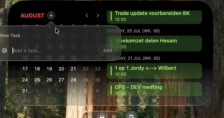
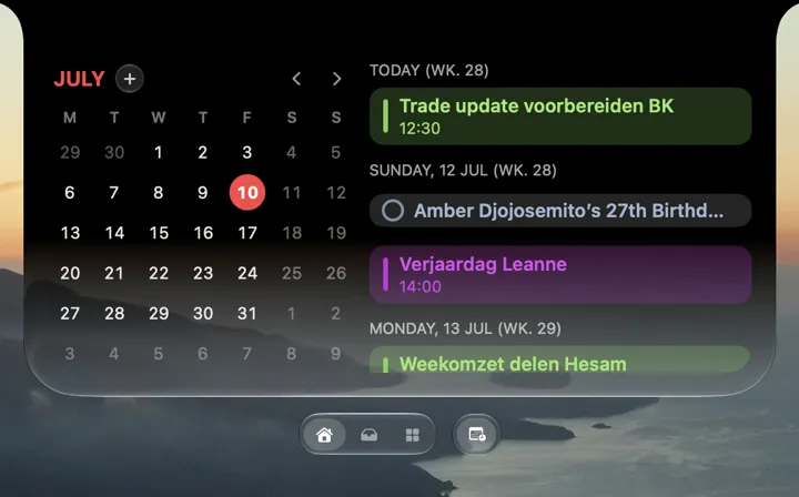
The same link shows up in the Tasks Shelf widget, on the calendar row, as Join Teams meeting or Open meeting link depending on what the event contains. If you prefer the Shelf to the notch, the join is in both places.
Mute and camera on a key you remember
Once you are in the call, the problem changes. The controls are inside a window that is not focused, often on another Space, sometimes behind the thing you are sharing. Finding the mute button is its own small emergency.
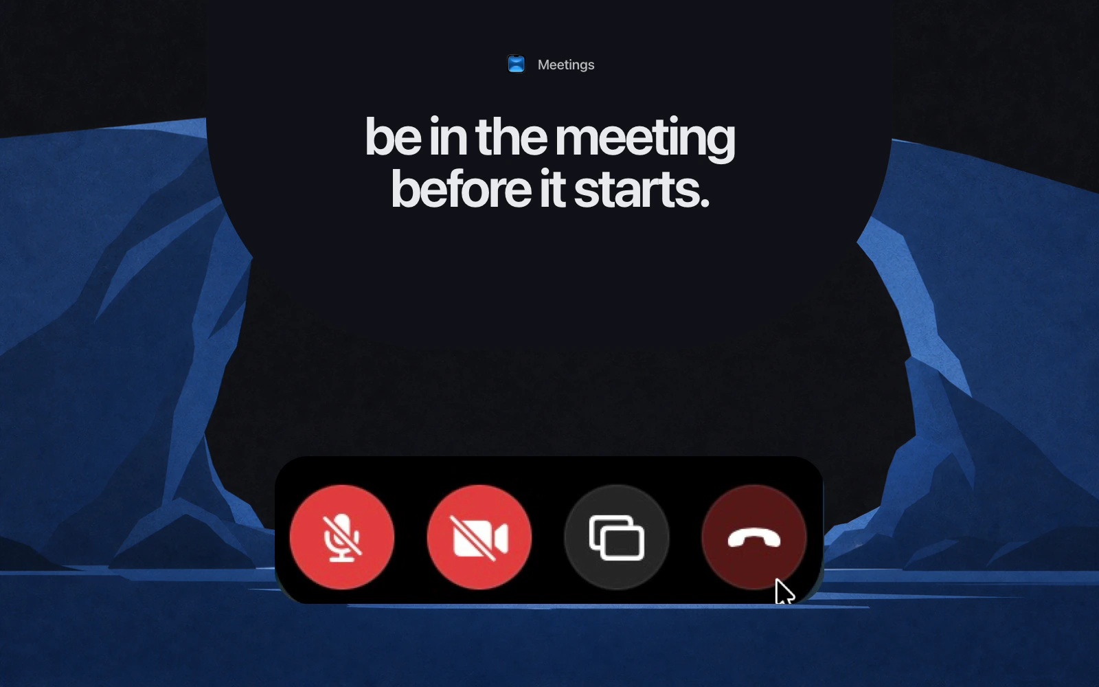
The Meetings Droplet is the answer to that, and its scope is deliberately small: four actions. Mute, Camera, Share Screen, End Call. They appear as a hover revealed row in the notch while a call is live, alongside a call timer, and they work with Zoom, Google Meet, Teams, and WhatsApp.

The more useful half is the shortcuts, because they are per app. Each meeting app already has its own key combinations and they do not agree with each other, so the Shortcuts section on the Meetings page lists Zoom, Google Meet, and Microsoft Teams separately, each with its own rows for the actions that app supports. Click a shortcut to record a new one, press Escape to cancel, and a reset control appears once you have overridden a default.
The defaults are each app's own, which is the right starting point if you already know one of them. The point of the section is that you can make all three agree. Pick one combination for mute and set it in all three, and muting stops depending on which call you happen to be in. That is the kind of shortcut worth learning, in the sense of shortcuts worth memorizing: one key, one meaning, everywhere.
Google Meet is missing an End Call shortcut, because it does not have a reliable one. That row simply is not there rather than being there and not working.
Button order that matches how you work
The four buttons come in a fixed order until you change it. On the Meetings page, the Buttons section has a Button Order row where you drag to reorder and toggle each one on or off.
This is worth two minutes. If you never share your screen, hide that button and the row gets shorter and easier to hit. If you hang up more often than you share, move End Call in from the end. If you present constantly, put Share Screen first. The row is small and lives at the top of the screen, so the difference between the right order and the default is the difference between hitting the button and looking at it.
There is one more setting worth knowing about. While you are sharing your screen, Droppy hides its own notch surface from what the viewers see, so your notifications do not become part of the presentation. It is on by default and it is the sort of thing you only notice when it is missing.
None of this makes meetings shorter. It removes the two moments that make them feel worse than they are: not being able to find the way in, and not being able to find the mute button once you are there. If you want the rest of what can sit at the top of the screen while you work, Live Activities on the Mac covers it, and Focus modes that stick covers keeping the hour before the call as quiet as the call itself.